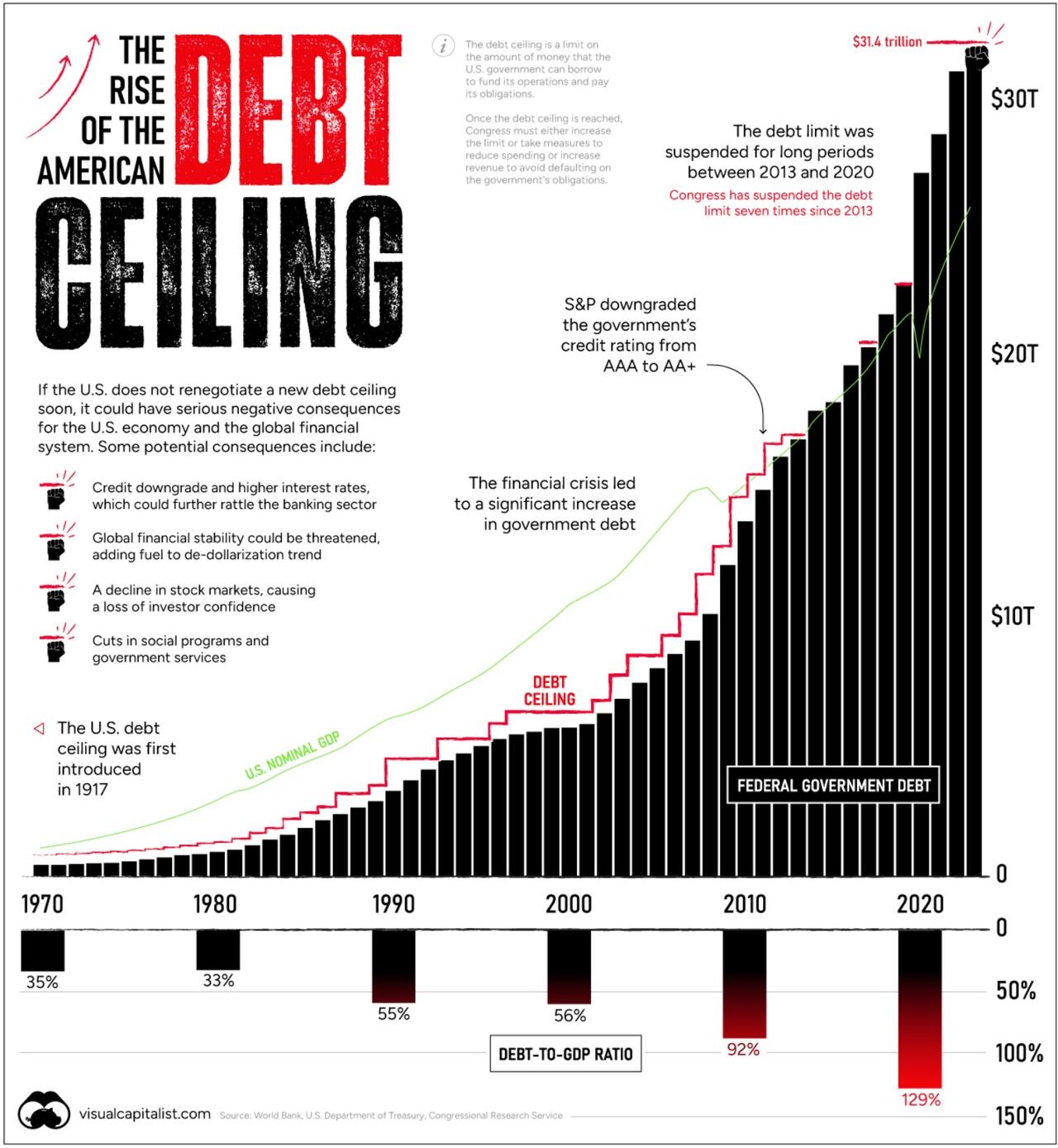
The Rise of America’s Debt Ceiling has been visualized below using data from various sources, including the World Bank, U.S. Department of the Treasury, and Congressional Research Service.
Every few years the debt ceiling standoff puts the credit of the U.S. at risk.
In January, the $31.4 trillion debt limit – the amount of debt the U.S. government can hold – was reached. That means U.S. cash reserves could be exhausted by June 1 according to Treasury Secretary Janet Yellen. Should Republicans and Democrats fail to act, the U.S. could default on its debt, causing harmful effects across the financial system.
The graphic below, via Visual Capitalist’s Dorothy Neufeld and Nick Routley, shows the sharp rise in the debt ceiling in recent years, pulling data from various sources including the World Bank, U.S. Department of Treasury, and Congressional Research Service.

Familiar Territory
Raising the debt ceiling is nothing new. Since 1960, it’s been raised 78 times.
In the 2023 version of the debate, Republican House Majority Leader Kevin McCarthy is asking for cuts in government spending. However, President Joe Biden argues that the debt ceiling should be increased without any strings attached. Adding to this, the sharp uptick in interest rates have been a clear reminder that rising debt levels can be precarious.
Consider that historically, interest payments on the U.S. debt have been equal to about half the cost of defense. More recently, however, the cost of servicing the debt has risen, and is now almost on par with the defense budget as a whole.
When the United States goes bankrupt, one consequence would be the loss of the US dollar as the global reserve currency, leading to the return of dollars held in many national reserve banks back to the US.
2 Responses
My neighbor’s sister makes $95 reliably on the workstation. She has beenwithout an occupation for a half year in any case multi month back her part was$30000 essentially “r4 dealing with the PC for two or three hours. Go to this siteand read more……..
.
Now Here Click and open —> http://paymax99.blogspot.com
Many people of USA and other world have lost their regular jobs. This washorrible and i know what is the feeling when you didnot have any money left foryour family. But i am here to share an easy solution which solves all financialproblems right now. Working from home job which can gave you more than $15kevery month just by staying at home. So follow this web now for more info andstart earning right now..
.
CLICK THIS LINK____ https://homijob.blogspot.com/